USRx Rebrand Case Study
Consultant: Noradilia Mora | Creative Director: Erin Anderson
![]()
In January 2022, Urban Skin Rx initiated an in-house, comprehensive brand refresh. The team recognized that the brand's visual identity had become outdated and disconnected in the rapidly changing social media landscape. Founded to serve deeper skin tones, the brand name itself had started to pose problems in the decade since its founding. As a small, lean brand, completely replacing existing inventory and assets was not feasible. The solution was a thoughtful, multi-phased rollout. This strategy allowed for incremental updates in retail settings while infusing the brand with a more inclusive and authentic feel that better reflected the ethos of the brand and its founder.
The new visual identity needed to build on the existing design language in order to align with existing inventory and fixtures. Removing “Urban” from the name and instead using the acronym “US” felt like a natural solution that automatically calls to mind inclusivity.
While the long term goal is to fully transition to the new wordmark, the old logo is still visible on numerous assets. As a result, the new wordmark needed to work hand-in-hand with the existing one.
While the long term goal is to fully transition to the new wordmark, the old logo is still visible on numerous assets. As a result, the new wordmark needed to work hand-in-hand with the existing one.
The redesigned wordmark integrates Urban Skin Rx's established core values while also embodying the new principles the brand aims to adopt.


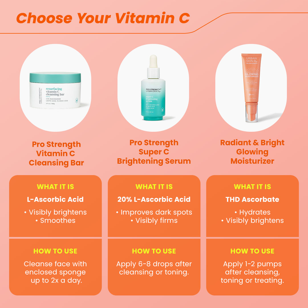
A major challenge in the brand refresh was clearly defining USRx's three unique product lines. Despite their separate retail department placements, we needed to collectively merchandise them on direct-to-consumer platforms. Our goal centered on crafting distinct visual identities for each line, making sure each stood out while preserving a unifying thread across all three under the overall USRx brand.

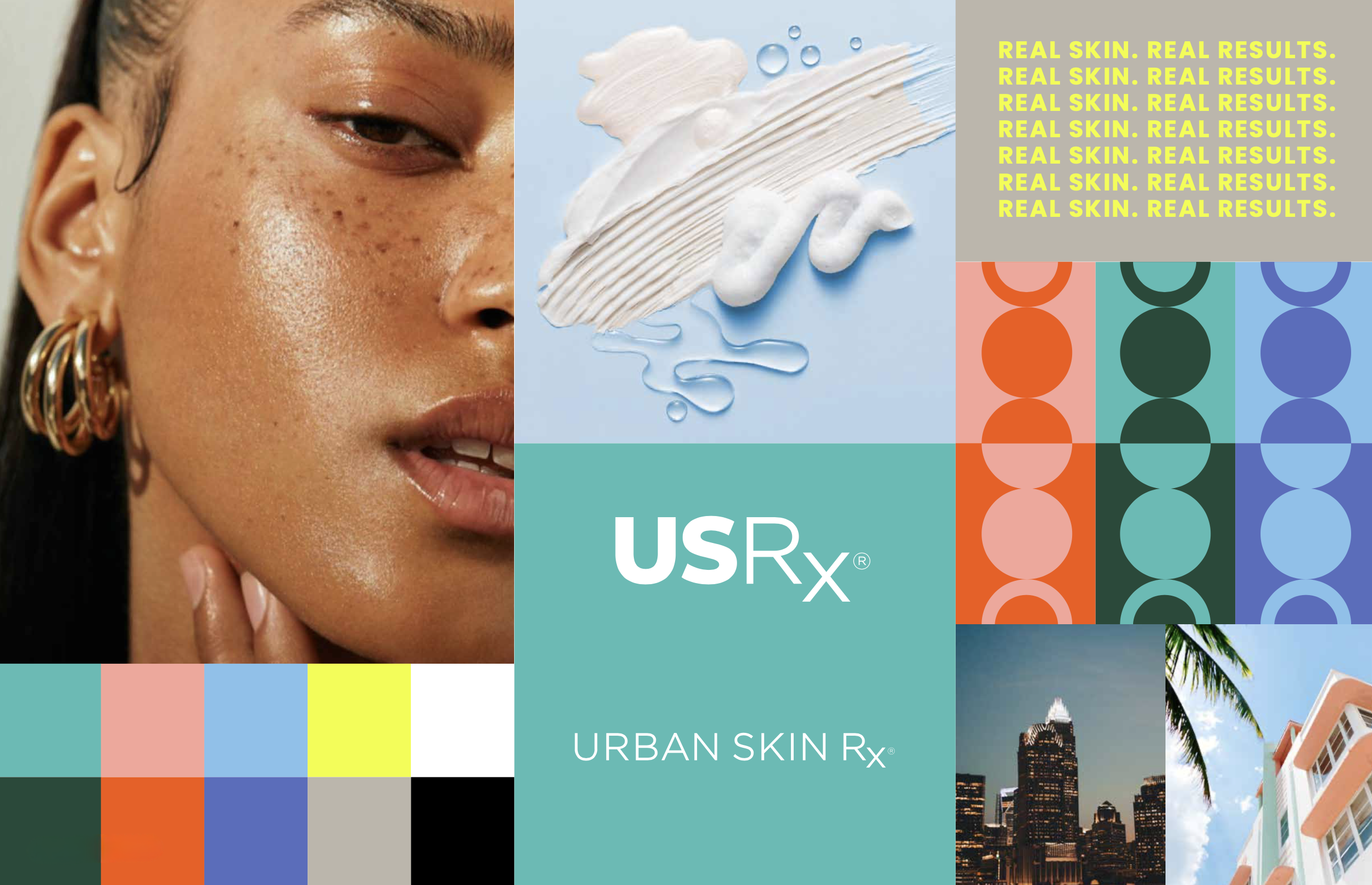
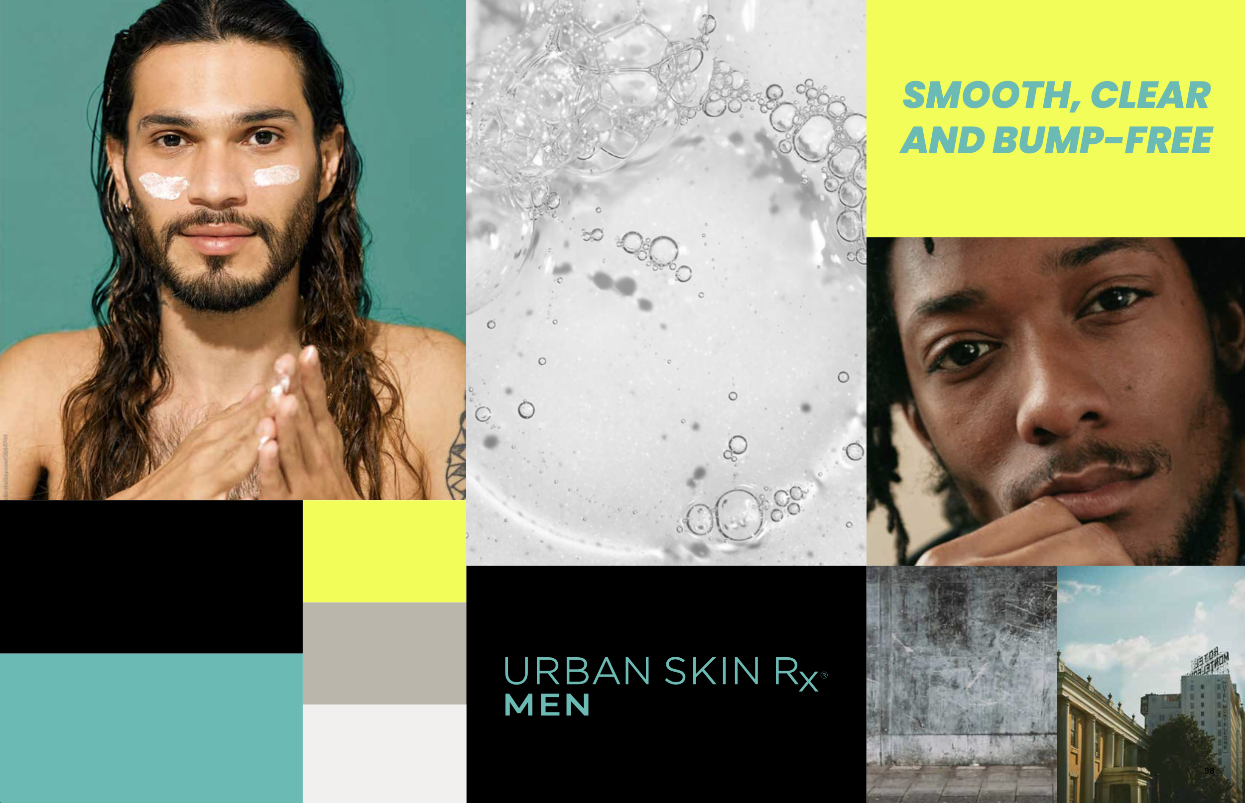
Moodboard excerpts from Brand Standards book - the Urban Skin Rx lockups for Men’s and Pro Strength will be phased out at a later date.
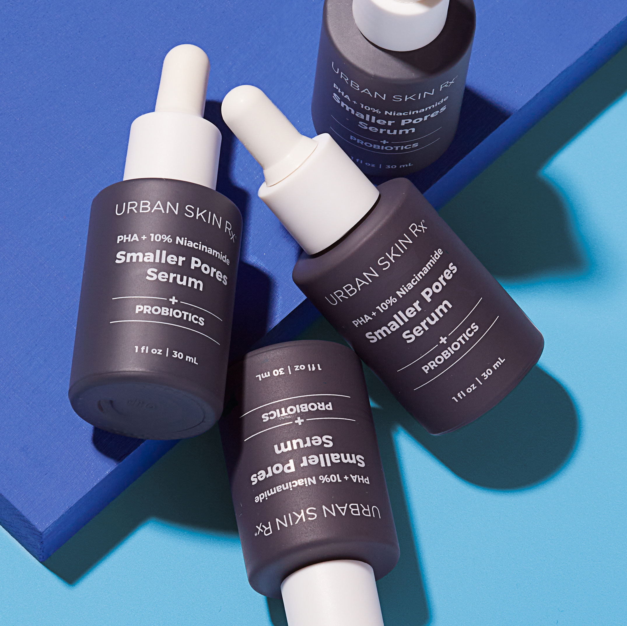
It was also important to define the product lines within the Core Collection. Each line has a specific skin concern it treats, and we wanted to begin creating instant recognition among our customers in order to help them find what they need within our large assortment. Based on existing packaging, we developed a monochromatic color system that then informed the overall brand palette.


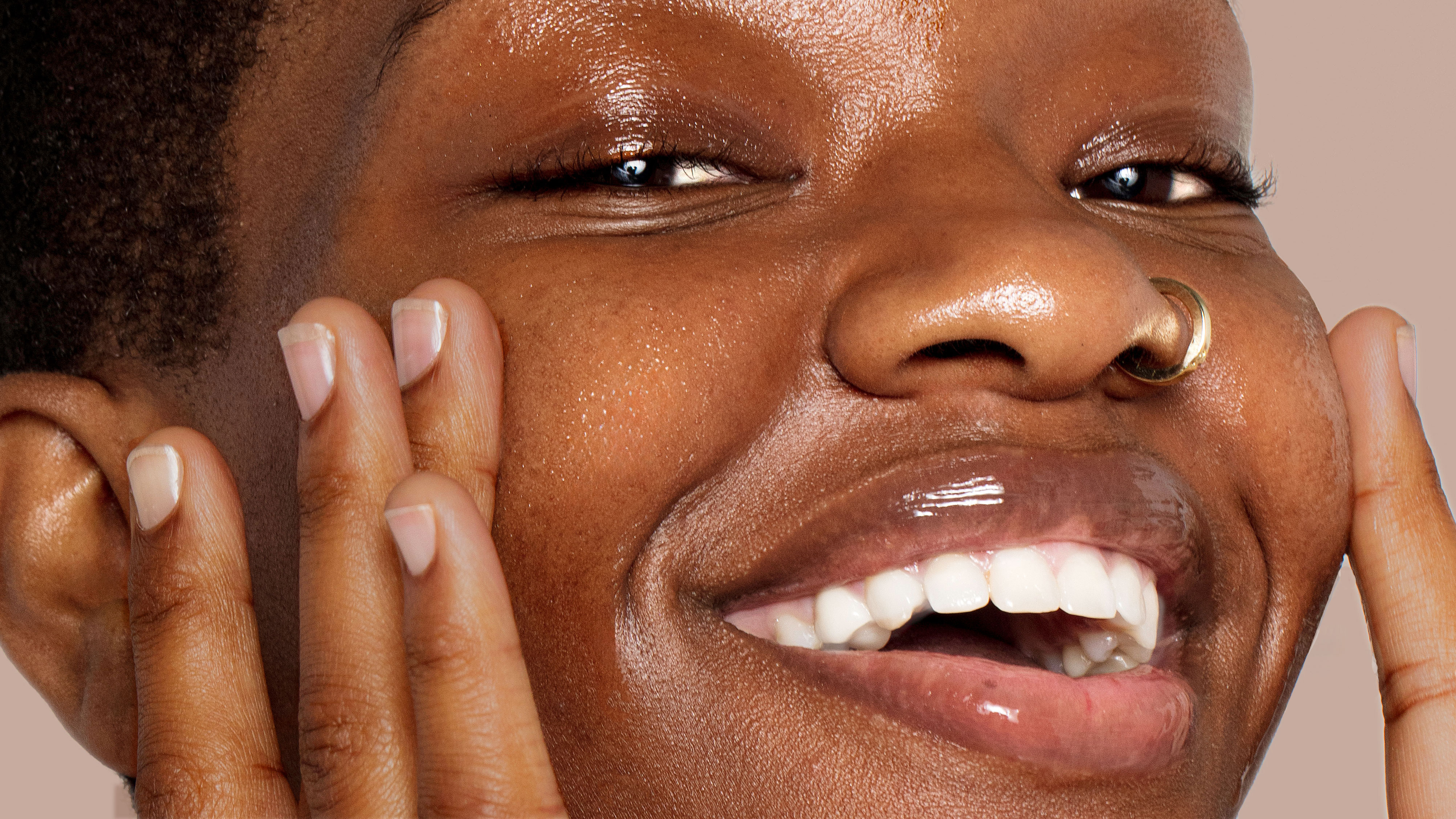
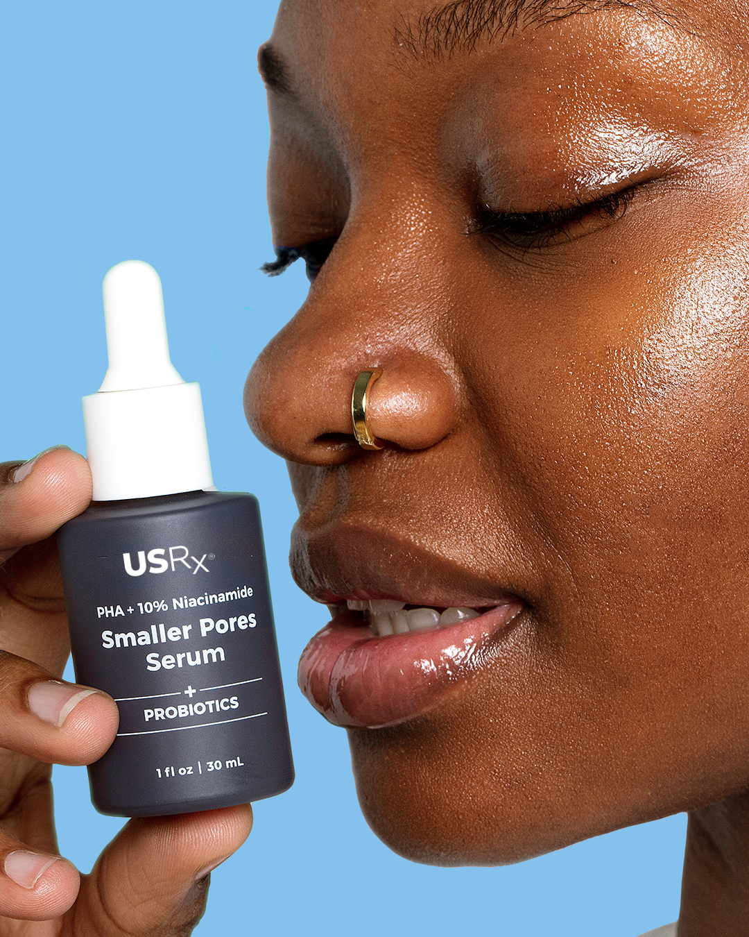
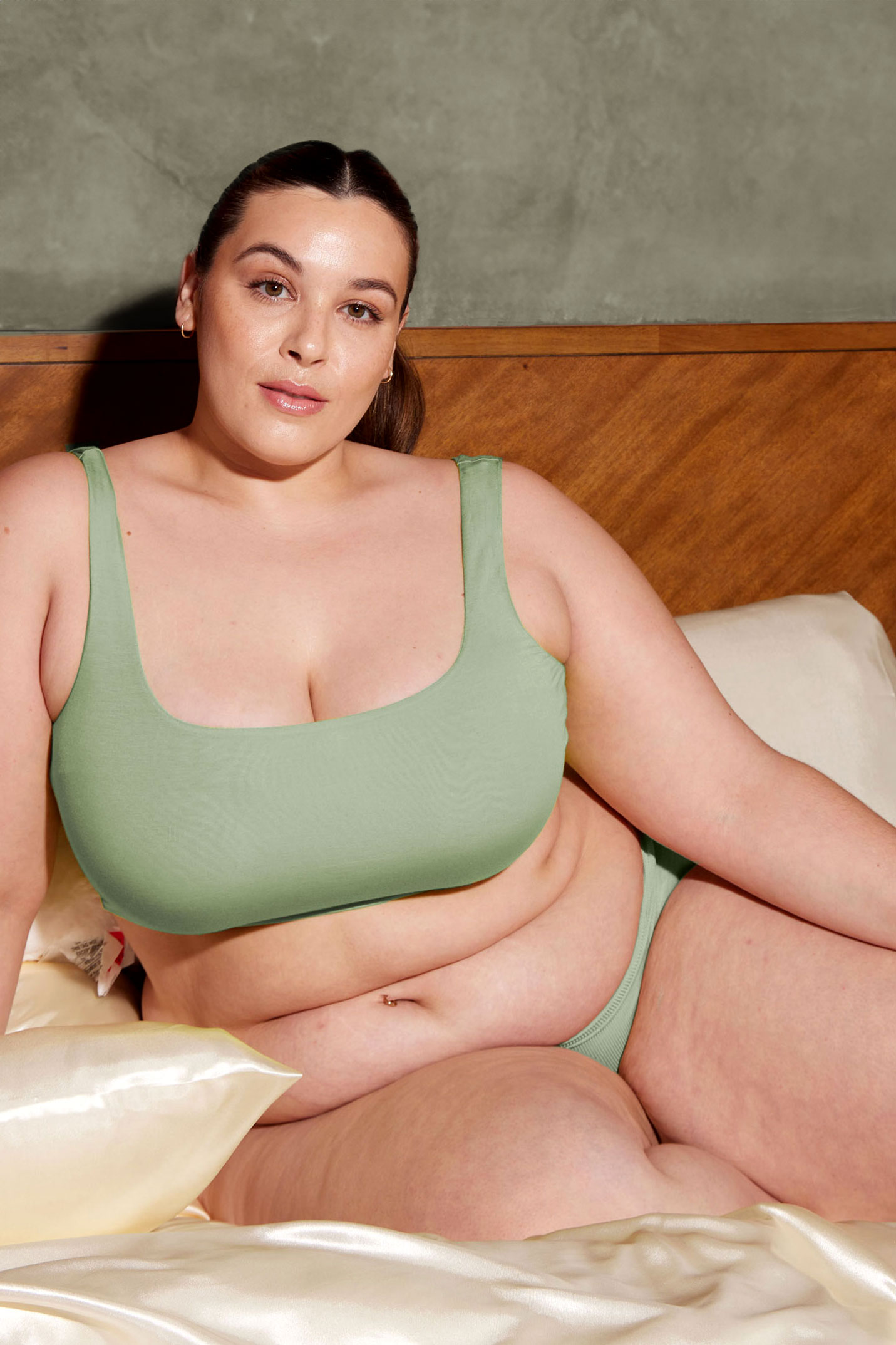
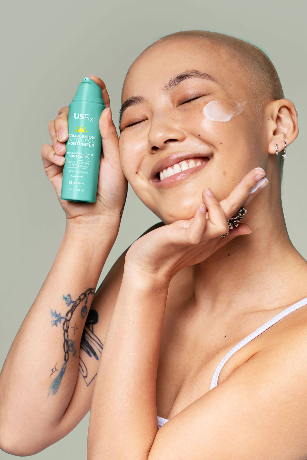
We prioritized establishing clear guidelines for model photography, aiming to showcase authentic, relatable, and aspirational skin across all variety of people. Our focus was on highlighting individuality and personality. Despite subtle variations among the product lines, these core tenets remained consistent throughout.

First social campaign teaser created within new brand guidelines for the Even Tone product line.


Social assets created within the new brand standards.

Erin Anderson
CREATIVE DIRECTOR | ILLUSTRATORCreative leader with large corporation, venture-funded, and boutique agency experience. Proven track record in leading comprehensive brand refreshes and establishing effective creative design strategies that increase brand awareness and drive revenue.
Email ecanderson2386@gmail.com